02. Pages
FLEET OVERVIEW
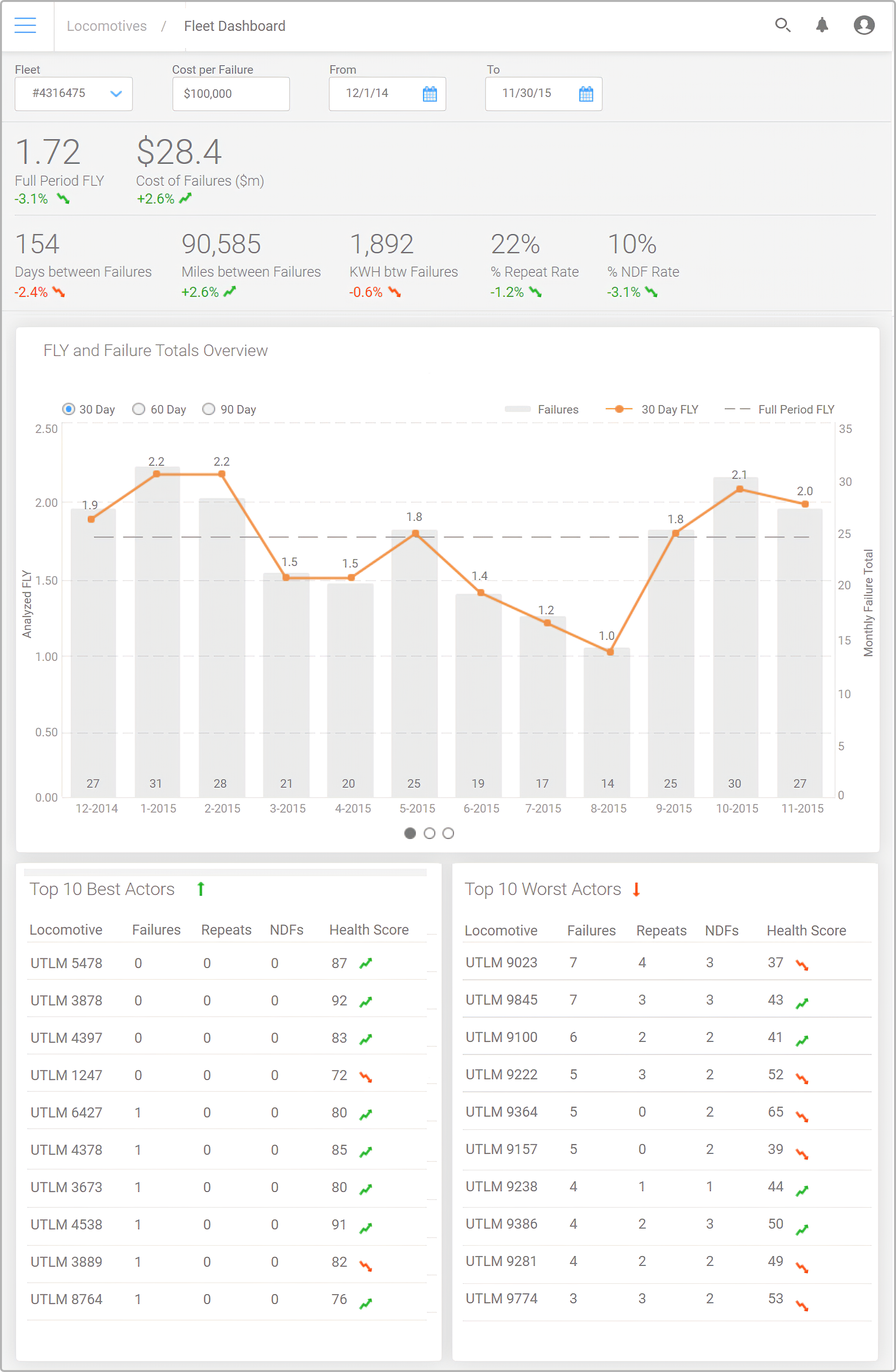
The fleet page is used to select a given grouping of locomotives. It allows the analyst to view relevant KPI on that grouping. Along with the KPIs, an analyst can see a data visualizations displaying info such as FLY period, component failures, and NDF metrics. The bottom two lists exist as a metric used to quickly identify the 10 worst performing locomotives over the given period.


02. Pages
FUEL
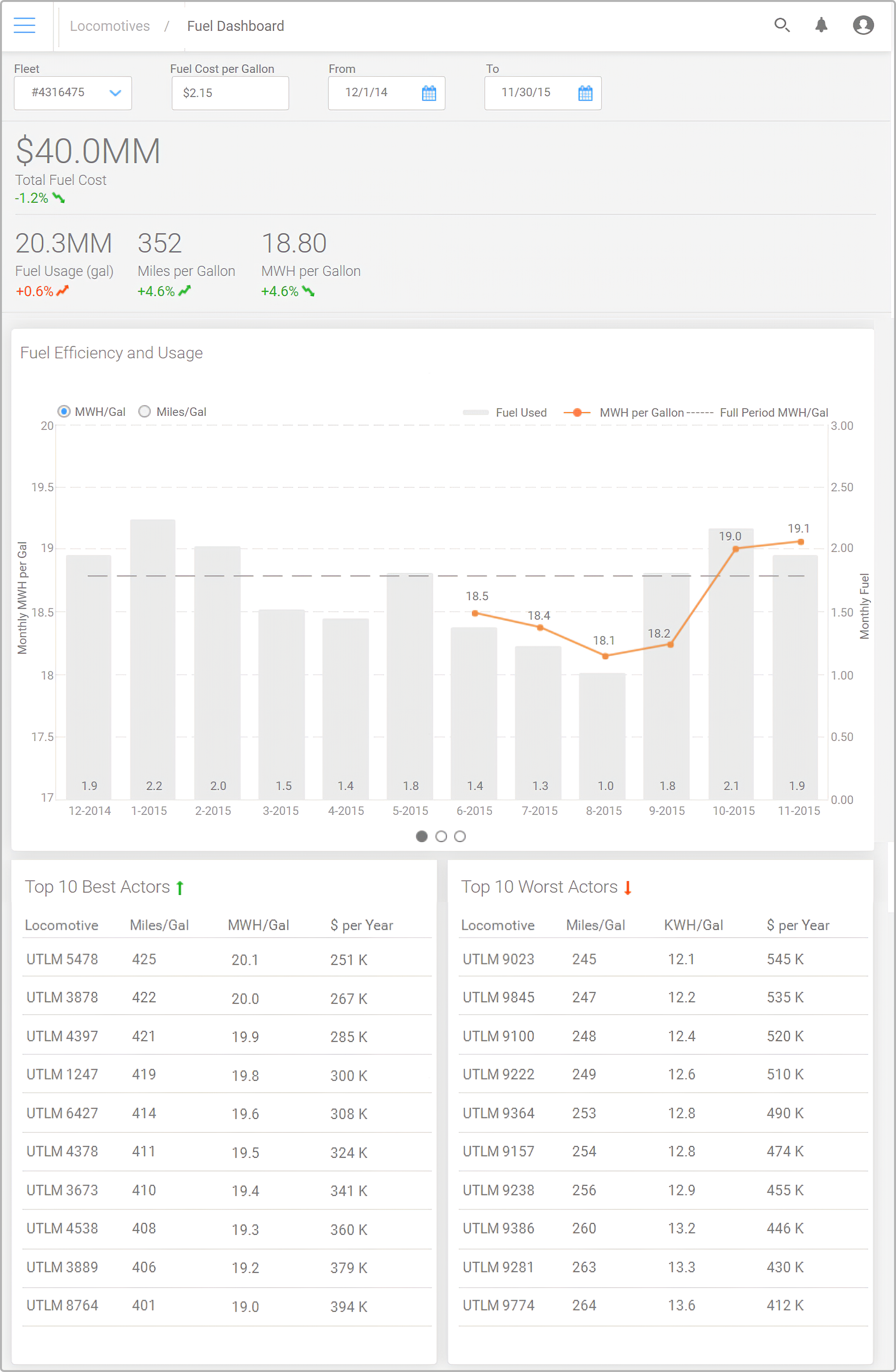
One major area identified in being able to provide insight for cost savings is in fuel. Rail companies spend billions every year in fuel and it’s not always used in the most efficient way. Older locomotives or ones that are in operation but need repair typically suffer from fuel burn so we again use a similar look to the fleet screen but change up the KPIs. In addition to the KPIs we serve a few different data visualizations including a heatmap of common fuel burn locations.
02. Pages
SHOPS
The last screen that is important for these users would be seeing an overview of shops across the country. Allowing them to access individual shops from the map at the top, while showing an overview of the broader shop ecosystem and the performance of them. Giving them info on the amount of failures handled by a shop and the average time it takes for a shop to handle that.
